Handwriting Analysis

Found at: https://unsplash.com/s/photos/writing
- Disclaimer: Graphology is not always accurate. Many graphologists have different interpretations of different handwriting elements, but these are the most common interpretations I found.
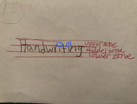
Upper, Middle and Lower Zones
Graphologists believe the upper, middle, and lower zones of a person’s handwriting can represent different things.
The upper zone is the upper most part of a letter (letters that are as tall as a capital letter when they are lower case are in the upper zone, such as “t” or “f”). The upper zone represents your thoughts in your head (Example: daydreaming, creativity, etc.). A large upper zone can show that you are very intellectual.
The middle zone is the space between the upper zone and the lower zone. The middle zone represents your everyday behavior and how you act, and how you view yourself. A dominant or bigger middle zone can indicate that you base a lot of your decisions on your feelings.
Last but not least the lower zone is the lowest part of the handwriting (the letters g, q, p, j, y, extend down into this zone). The lower zone represents your wants/desires. If you have a bigger lower zone that could mean you are more materialistic.
Pressure of Handwriting
The more pressure you apply to the writing utensil when writing can tell how intense your emotions are. If you use a lot of pressure, it means that you are a person who feels things very deeply, but if you don’t apply much pressure, it means you tend to be calmer. One way to tell how much pressure is on handwriting is to look at how thick the lines of each letter are.
Slant
The slant of a person’s handwriting is the direction the letters lean towards. If your handwriting looks to be leaning toward the left side, then you might have more muted emotions or be more introverted. But the right slant can show that you are more open and can easily make friends. Handwriting that is straight can represent independence.
Base lines
A base line is an imaginary line that the bottom of every letter you write touches. A typical base line is slightly wavy. Overly straight base lines can indicate an overly perfectionist personality. But a wavy one that goes up and down a lot can be a sign of emotional instability.
A baseline that is descending is a sign of mental illness and having a negative view of the world. But in contrast an ascending baseline can be a sign of optimism and positivity. But a normal baseline means you are a realist.
Fluidity/Separation of Letters
Fluidity (how connected the letters are) of letters means that a person is able to move from one thought to another very smoothly. However, if letters are very separated or disconnected it can mean you have difficulty shifting your focus from one thing to another.
Fast Facts
- Writing in all capital letters can mean that a person is uncomfortable talking about their personal lives.
- Cursive writing can indicate a highly emotional personality.
- When writing a lowercase “i” if the dot is placed highly on the page, it can be a sign of a highly active imagination, but a low dot can mean you are more organized, and detail orientated.
- When letters are connected in handwriting it can mean that you base a lot of your decisions on facts and experience.
Handwriting Analysis
Writing Sample #1 (Person 1)
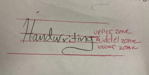
The upper and lower zones appear to be larger than average. This can show that Person 1 is a bit intellectual and a little more materialistic than most. The letters also seem to be a little disconnected which can indicate they can have difficulty shifting their focus.
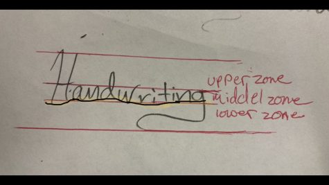
The baseline for Person 1’s handwriting seems to be slightly curvy and slightly ascending. This shows that they are a little bit more emotional than the average person and has a slightly positive outlook on life.
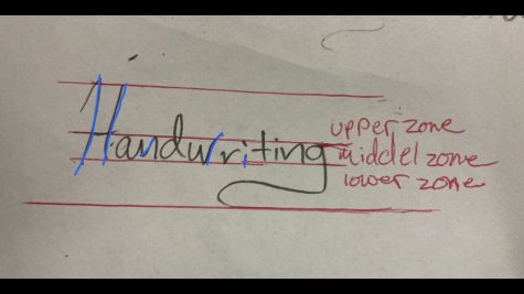
Their seems to be a slight slant to the right which can be an indicator of an emotional person.
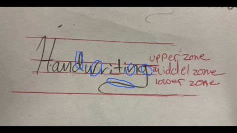
We can see in the circled portions of the letters that this person tends to have a heavy hand while writing and this could mean they feel things deeply.
Writing Sample #2 (Person 2)
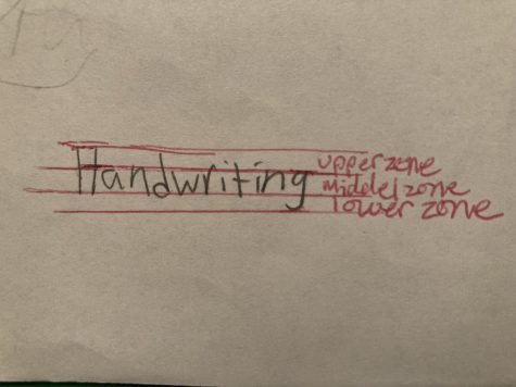
The middle zone seems to be slightly larger than the upper and lower zones which can show that they base slot of their decisions on emotions rather than reasoning. Also, the letters don’t flow into one another at all which could mean their thoughts are very disconnected and can be more introverted.
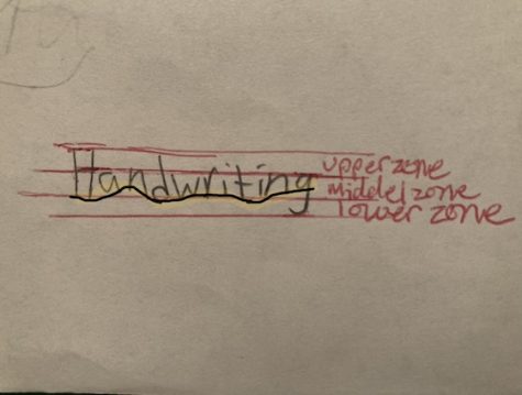
The baseline for Person 2’s handwriting seems to be a bit shaky which can show that they have a lot of emotions.
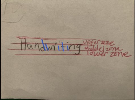
Most of the letters seem to have a slight slant to the left which is a sign of a more introverted person.
The dot above the “i” appears to be higher than average. Which can be a strong sign that Person 2 is very imaginative.
Thank you to both people that volunteered their handwriting samples! I really appreciate it. 
Media Used:
https://blog.hocking.edu/how-to-study-your-handwriting-and-what-it-means
https://www.scienceofpeople.com/signature-analysis/
https://www.grapholistic.com/blogs-articles/is-your-handwriting-baseline-rising-declining-or-rigid
Your donation will support the student journalists of Dakota High School. Your contribution will allow us to purchase equipment and cover our annual website hosting costs.

Isabella Aluia is currently a Dakota Highschool senior. They enjoy spending their free time doing anything that involves creativity (drawing, occasionally...


